

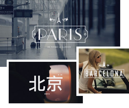
I wouldn’t say that EF International Language School is particularly known for it’s great graphic design or a sense of style. However, because of this reason, I was pleasantly surprised and pleased to see that the creators behind the school’s commercials managed beautifully to convey emotions through their use of typography and images. I would say it’s one of the most successful example of merging typography and motion picture. Made me wanna be 20 again – and hit the road. All five clips can be found on Vimeo.
Text: Sven Hausherr
Published in Cee Cee #14 on 21.7.2011
